Moodboards Elle Decoration
'Inspired by'... Elle Decoration June 2012
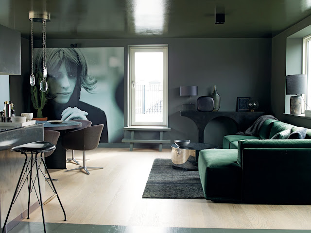
Welcome to the first in my 'Inspired by' moodboard series, which features a double page spread that took my fancy in this month's Elle Decoration.
Do you find that you have so many favourite pages in magazines that they tend to get forgotten in the pile? You then find them a few months later and wish you'd torn them out for some decorating inspiration, or to simply create a simple display of your favourite objects.
Whether it's a particular colour, a beautiful home, or a fashion spread that takes your eye, pull out the page and create a moodboard-it doesn't have to be anything too grand or complicated. Bring in your favourite colour chips-like the fantastic new colour card from Little Greene-see below (more about this soon). Build on it a little at a time until you're happy with the finished look and you could even try re-creating the scene as I've done below... Which is your favourite montage?
Credits:
All plants and pots from a selection at Homebase, 0845 077 8888
Little Greene paint swatch card, 0845 880 5855
Terence Conran's Inspiration and The Essential House Book, both by Conran Octopus
Asian Elements, Conran Octopus
The Home Modernised, Jacqui Small Publishing
Ornate white frame from a selection Paperchase
Pantone colour postcards


Beautiful. I love these colors together. They're all lovely but my favorite montage is the last one!
ReplyDeleteThanks Amberly! Nice to see you here again! Have a great weekend!
DeleteThis is gorgeous Caroline! I love all the greenery with the slightly rustic elements.
ReplyDeleteHi Sophie! Thank you! Love your My Deco post today! Cx
DeleteGreat colour and style inspiration
ReplyDeleteThanks Phyllida-may try and get next one out at a more reasonable hour!!x
DeleteI can't decide between 2 and 4 ... hmmm. I think 4. Ok, let's say 4.
ReplyDeleteI really like the colour theme here Caroline!
Have a great day Xx.
Hi Holly! Thanks! it's great to hear who likes what! Have a lovely weekend! Cx
Deleteohhh hard to choose but I'm going for the second one - I especially like the plan view with the clock and the frame.
ReplyDeleteThanks so much Cari-Jane! Have a lovely weekend!
ReplyDeleteI like all them all, but as I have to choose I will go for the second - the combination of colour pics and the black and white works really well!
ReplyDeleteHave a fab weekend Txx
Thanks Toni! See you v soon!!x
DeleteHi Caroline. Thanks for stopping by the blog. These moodboards are a great idea. A fun little way to be creative.
ReplyDeleteThanks so much Petit Coterie! :-)
DeleteSurprisingly, I'm going to go with 2... I think I find the plant too overwhelming in the others. I particularly like the black and white pic in there. Nice that you use the mag as inspiration like this. Inspiring!!
ReplyDeleteHope you've had a lovely Bank Holiday and enjoyed that yummy soup xx
Thank u Tina-good to hear another angle on the pics too. Soup was delish!!! (I'm still cold!)xx
DeleteYour photographs are absolutely beautiful.
ReplyDeleteThank you so much Carol! Your cottage by the sea looks so lovely-what a wonderful place to live! Thanks so much for stopping by and commenting! :-)
DeleteOooh - lovely! I'm going against the grain and saying that my favourites are 1 and 3! I like seeing the whole display in colour. The colours are so subtle and work brilliantly together - particularly the hints of pink in the painting and the 'Inspiration' book title, and then again from the 'eye' peering out. Great idea too - I have FAR too many magazines lying in piles around the house. I'm slowly edging towards pinterest as a means to collate my inspirations and de-clutter, but as it takes me a decade more than most people to be dragged kicking and screaming into the 21st Century technology-wise - I haven't gone beyond considering it yet! Paula x
ReplyDeletePaula-don't talkk to me about technology-I'm very firmly in the last century-very slowly but surely working it all out! Fab comments-thank you so much for joining in the debate! Cx
ReplyDelete